
Friday, November 9, 2012
Mind your P's and Q's

Tuesday, November 6, 2012
Type!
This week/last week we were able to set type, which is actually a really soothing activity. I found that once I got to working on setting out my paragraph and finding the letters, my hands started to remember where the letters were and it became muscle memory to just go grab the letter I needed. I wasn't sure how exactly the process worked at first, because I had never really seen the type itself or the method in which it was held. But once I saw how everything was set up, it was pretty clear to me how it worked.

What amazed me, though, was thinking back to how people used to make entire newspapers by doing this. And some newspapers were daily editions, so the type had to be set and changed every day. Not only that, but there were stories that needed to be written before they were set in type, and then the type needed to be checked for errors. That makes today's methods of printing newspapers seem SO much easier. Seems to me that there shouldn't even be mistakes in today's newspaper, considering all we have to do is click on some letters and use spell check to correct things. And mistakes can be removes supremely easily. It's a wonder to me that people were able to make so much using movable type.

However, I really enjoyed the activity, and would like to do it again. For me the fun was just in finding the letters and seeing how efficient I could become, how fast I could go without making a mistake. In all of my efforts, I only ended up making one mistake, which was an inverted period. That's what I get for competing with myself!
What amazed me, though, was thinking back to how people used to make entire newspapers by doing this. And some newspapers were daily editions, so the type had to be set and changed every day. Not only that, but there were stories that needed to be written before they were set in type, and then the type needed to be checked for errors. That makes today's methods of printing newspapers seem SO much easier. Seems to me that there shouldn't even be mistakes in today's newspaper, considering all we have to do is click on some letters and use spell check to correct things. And mistakes can be removes supremely easily. It's a wonder to me that people were able to make so much using movable type.
However, I really enjoyed the activity, and would like to do it again. For me the fun was just in finding the letters and seeing how efficient I could become, how fast I could go without making a mistake. In all of my efforts, I only ended up making one mistake, which was an inverted period. That's what I get for competing with myself!
Monday, November 5, 2012
The Smallest Beginnings
It's hard imagine that books that can be as big as a computer can come from such small beginnings. So many pages and so much writing comes from tiny little pieces of lead. Something as complex as, say, the bible was made up of tiny little letters individually placed. The amount of work required to make a book in the past is incredible.
One also has to consider the frustration that would come from messing up a sentence, or even just one word. It might mean you would have to redo the entire thing, and that would take forever. And if the entire phrase falls apart, that's even worse. It makes you appreciate how much work was put into books by the printers.
Also, I wonder if they ordered different style of letters for different books. If all of the books from a publisher were in the same style, I would wonder if people who wanted a specific style of text would go to a different printer. An interesting way to cause rivalry.
One also has to consider the frustration that would come from messing up a sentence, or even just one word. It might mean you would have to redo the entire thing, and that would take forever. And if the entire phrase falls apart, that's even worse. It makes you appreciate how much work was put into books by the printers.
Also, I wonder if they ordered different style of letters for different books. If all of the books from a publisher were in the same style, I would wonder if people who wanted a specific style of text would go to a different printer. An interesting way to cause rivalry.
Monday, October 29, 2012
Setting Type
Last Monday, we finally got to set some of our type for our book up in the workshop, and once again, I was surprised at how hard it was to actually get the letters in the right spots without any major mishaps. I'm one of those people who is constantly checking and overlooking her work to make sure that there's nothing out of place, so I became really confused when I couldn't even read the words that I had spelled out so far. Normally, I can read all kinds of words in any kind of direction; backwards, forwards, upside down, even mirrored words make sense to me. However, It took a long time for me to get used to the words because not only were the letters mirrored, the letters were mirrored without flipping the location of the letters, making it backwards as well (from my perspective). I can't even imagine how hard it must be to set type for an entire novel without at least a few mistakes sprinkled somewhere in the pages.
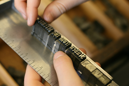
I also thought that just getting the letters in the right order was confusing. Instead of being able to hand write everything or type everything on a computer (where we already have a basic understanding of where all the letters are located), we had to get used to an entire new position for all of the letters we needed, some of which were in really strange positions (You tend to notice these things when your last name starts with a "Z"). All in all, I've gained some healthy respect for anyone who used to set type before the age of computers and spell-check, not only is it confusing, but you also need to make sure that everything is set perfectly, or the pieces will literally fall around you.

I also thought that just getting the letters in the right order was confusing. Instead of being able to hand write everything or type everything on a computer (where we already have a basic understanding of where all the letters are located), we had to get used to an entire new position for all of the letters we needed, some of which were in really strange positions (You tend to notice these things when your last name starts with a "Z"). All in all, I've gained some healthy respect for anyone who used to set type before the age of computers and spell-check, not only is it confusing, but you also need to make sure that everything is set perfectly, or the pieces will literally fall around you.

Sunday, October 21, 2012
We All Make Mistakes
I can bet that there was not one of us who didn't make some type of blunder on the wood carvings or our book bindings. Like I said in my earlier post, I was incredibly OCD in trying to make everything perfect and look flawless, but we all realized that that was just about impossible. It's kind of ironic though that a lot of the aspects of the books that we have looked at have been mistakes or had been added later after the book had been published. We saw an example of this in class when we were shown the famous wood carving against slavery.

The blunders near the face and the unfinished parts of the wood carving showed that this wood carving had not ever been used in publication. At the time, it must have been incredibly frustrating for the wood carvers to see all their hard work go to waste (and we all know how much work this would take!), but what they didn't know was that this wood carving could give it more value in the far future for being different with its mistakes.
The mistakes made in different publications of the same book also can give readers in the future an idea of what books were published first and then corrected for later publications of the book. These mistakes can give an ancient treasure even more value with it's difference. It also become the book's signature sign of uniqueness and distinguish it among other publications of the same book among collectors. Mistakes don't always have to be negative, but it's kind of funny how that mistake can sometimes be that book's trademark.
The blunders near the face and the unfinished parts of the wood carving showed that this wood carving had not ever been used in publication. At the time, it must have been incredibly frustrating for the wood carvers to see all their hard work go to waste (and we all know how much work this would take!), but what they didn't know was that this wood carving could give it more value in the far future for being different with its mistakes.
The mistakes made in different publications of the same book also can give readers in the future an idea of what books were published first and then corrected for later publications of the book. These mistakes can give an ancient treasure even more value with it's difference. It also become the book's signature sign of uniqueness and distinguish it among other publications of the same book among collectors. Mistakes don't always have to be negative, but it's kind of funny how that mistake can sometimes be that book's trademark.
Tuesday, October 16, 2012
Color Me Impressed
I know I took illustrations in books for granted before this class. Even if nowadays they are much easier to make, their beginnings, as we have now seen, were much humbler. Instead of a scanner and a computer, illustrations were done using a block of wood and carving tools. Just hearing this you can understand that this is an impressive feat.


Actually doing the woodcutting myself was a learning experience. First, I pulled the biggest derp move and carved out the actual illustration, instead of carving out the space around it. So instead of a colored icon and white around it, I had a white icon with ink around it. While some may prefer this and do it by choice, this is not at all what I meant to do, and it would've been easier to cut the other way anyways. But, I learned from my mistake and if I ever get the chance to do a woodcut I'll do it right and come across as an expert. Not.

An expert on the background of woodcuts I'm definitely not. However, my knowledge of them is much better than my skill in making them. Above is a crazy impressive woodcut. Look at the details in the shading! My illustration was blocks of ink and blocks of white. Nowhere on it did I even attempt to do any kind of shading. And it is in the actual skill that we, as people that have attempted it ourselves, can really appreciate woodblock illustrations.
Monday, October 15, 2012
Social Change

Today we discussed the impact books can have on society;
they have true shaping abilities. We touched on the topic of censorship too. I was fascinated by the sort of stamp of approval
provided by the censor in the book involving Herodotus. As soon as I saw the
markings in the preface, I associated it with what I had seen before in Huckleberry
Finn. Junior year we read Huck Finn in class and our copies provided by the
school were all marked up. In a way, this brought more attention to what was
being blotted out! What is your experience with censorship? Did your high
school have certain banned books? Where the line should be drawn?
On a semi-related note:
This weekend I went home, and it just so happened to be the weekend of our local “Friends of the Library Book Sale.” This is an annual sale of thousands of used books. Looking back, I could easily say that it has been an influential piece in the development of my love for books. I can recall from years past spending hours there with my family exploring the books. Being there this Saturday was even more fulfilling. I was able to look at the collections of books with a view shaped by my learning in Cushing. Seeing as these were used books, I noticed details of previous owners and various other features we have discussed in class. I am just certain among all those books were hidden gems waiting to be revealed!
This weekend I went home, and it just so happened to be the weekend of our local “Friends of the Library Book Sale.” This is an annual sale of thousands of used books. Looking back, I could easily say that it has been an influential piece in the development of my love for books. I can recall from years past spending hours there with my family exploring the books. Being there this Saturday was even more fulfilling. I was able to look at the collections of books with a view shaped by my learning in Cushing. Seeing as these were used books, I noticed details of previous owners and various other features we have discussed in class. I am just certain among all those books were hidden gems waiting to be revealed!
Subscribe to:
Posts (Atom)